

Audio available in app
Consider different devices and screen sizes when designing interfaces from "summary" of Designing Interfaces by Jenifer Tidwell
When creating interfaces, it is imperative to keep in mind the various devices and screen sizes that users may have. This is crucial because the same interface that looks great on a large desktop monitor may appear cluttered and difficult to navigate on a smaller smartphone screen. In order to ensure a positive user experience across different devices, designers must be cognizant of how their interface will adapt and respond to varying screen sizes. One approach to address this challenge is to adopt a responsive design strategy. Responsive design allows interfaces to dynamically adjust their layout and content based on the screen size of the device being used. By utilizing flexible grids and images, as well as media queries, designers can create interfaces that are optimized for different screen sizes, ensuring a consistent and user-friendly experience regardless of the device being used. Another consideration when desi...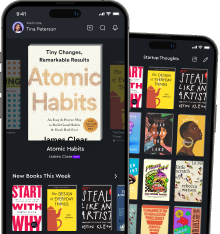
Similar Posts
Include accessibility features to support users with disabilities
When designing voice user interfaces, it is crucial to consider the needs of all users, including those with disabilities. Acce...

Stay informed
The importance of staying informed cannot be overstated in today's fast-paced world. With information constantly evolving and c...
Utilizing analytics can help you understand user behavior
By analyzing user behavior through analytics, you can gain valuable insights into how users interact with your app. This data a...
Integrate social media to expand your WordPress website's reach
One powerful way to broaden your WordPress website's audience is by incorporating social media into your overall strategy. Soci...
Designers should seek to create meaningful experiences for users
Designers have a unique role in shaping the experiences of users through the products and services they create. It is not enoug...
Utilizing Firebase can enhance your app's functionality
Firebase is a powerful tool that can take your Android app to the next level. By integrating Firebase into your app, you can en...